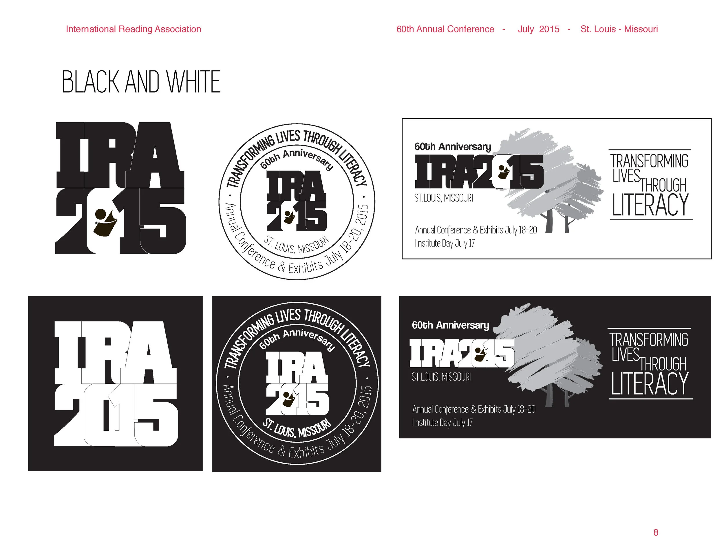
The International Reading Association* is an extensive non-profit organization dedicated to supporting literacy worldwide. Their annual conference is attended by thousands of educators and administrators. They asked Glib Communications to create a bright, modern logo for their 2015 Annual Conference.
Here is a peek into the process: messy at times, but always enjoyable and challenging.
* recently re-branded as The International Literacy Assn.